[ad_1]
Archaeologists of the future, should they find themselves sifting through the rubble of early 21st-century London, will find a distinctive layer. It will contain taps and door handles of Nordic design and manufacture, long sections of structural steel and the remnants of sliding glass doors. There might be chairs designed by mid-20th-century Danes, if they haven’t rotted away: by Arne Jacobsen in the older part of the layer, by Hans Wegner in the later.
From this evidence the archaeologist will know that they are looking at a period that started around the dawn of the Blair era and continues until the present. It’s a long enough time – almost a generation – but one in which a remarkably consistent style of home improvement, a sort of metropolitan vernacular, has grown up. It is well represented in the shortlist for the Don’t Move, Improve! award for home makeovers, now in its 10th edition, and the subject of a forthcoming exhibition at the gallery space of New London Architecture. The winner will be announced on 11 February.
Such projects typically start with a relic of Victorian or Georgian London, a brown-brick, slate-roofed terraced house originally thrown up by a speculative builder, usually with a damp basement, compartmentalised into rooms that suited the lifestyle of the clerks or artisans for whom it was originally built. It might be a bit rickety, its foundations minimal, its walls and openings out-of-true, but its sash-windowed front will have a certain cachet with both estate agents and the heritage officers of local planning authorities.
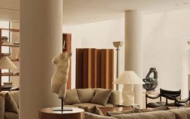
The facade will therefore be kept and repaired. Behind it, lifestyles having changed in the past century or so, there will be much opening up and scooping out. The watchwords will be daylight and generosity of space. Two rooms will be made into one, thanks to the magic of rolled steel joists. There will be, in the walls facing the garden, a lot of glass. The walls will mostly be white. The doors of kitchen cupboards will be flush. There may well be an island unit. There might be some clever use of plywood, in the interests of keeping costs down, offset by the sparing use of some choice veneer on significant surfaces.
An area of cleaned-up brickwork might be retained, as if placatory to the household gods, but the new work will mostly be everything the old is not. The latter is porous, approximate and uneven, the former engineered, clean-lined and rigid. One is happy to let moisture, cold and draughts breeze in an out, the other keeps the elements under control. Yet the two strike up some kind of alliance, the two philosophies of domesticity and construction combining to form a successful hybrid. The retained fronts maintain an idea of inherited propriety; the revamped interiors express contemporary ideas of openness.
And why not? If a formula has been found that works, why change it? While these high-specification domestic investments are a reflection of the London property values that underwrite them, there’s not much point blaming them for the housing crisis of which they are side effects. That would be a case of shooting the messenger. If modern technology allows for more glass than before, why not exploit it to the full? The Georgians did exactly this with the more limited means at their disposal, the history of domestic architecture being at least partly one of ever-enlarging windows.

And so Don’t Move, Improve! contains works such as the Soffit House by Proctor and Shaw and Handen House by Selencky///Parsons, which on the available evidence are well-made and civilised interiors of a kind which wouldn’t have been possible until relatively recently. They represent progress, they do their job, I expect they give pleasure to their users. But a voice asks if this is it. Has the question of the London bourgeois interior, and of domestic environments in general, been answered for all time? Is there nothing left to say?
You’d hope not, for which reason something like the Twist House, by the architects Urban Mesh, leaps out. Here a small rear extension has been enveloped by some remarkable brick contortions, with spiralling columns and interweaving arches, as if the material had absorbed the DNA of the ivy that traditionally grows on brick walls. The architects claim as inspiration Fritz Höger, a German expressionist who flourished in the 1920s, although there’s also something Tudor about the design. Elizabethan-expressionist, then. The project wins marks for originality, although the small room that the brickwork encloses, being normal and rectangular, seems to struggle to keep up with the extravagant exterior.
White Rabbit House, by Gundry & Ducker, offers a level of invention that is sustained throughout the project. Here a mediocre postwar neo-Georgian house has been comprehensively rebuilt so as to allow three floors inside a volume where there were formerly two. There are the usual knocked-out walls and big windows to the garden. What makes it different are a high staircase that manages some baroque curves and doubling-back in a narrow space, and an enfilade of arches that runs from front door to garden.
This vertical and horizontal, stair and arches, combine to create a sense of occasion around the business of moving through the house. There is compression and release, light and shadow, weight and delicacy. Terrazzo, mottled like nougat, makes the floor of the enfilade and the kitchen worktop, at one point becoming a chequerboard pattern of light and dark. The stair finish, starting off in terrazzo, becomes timber as it rises, becoming less formal and more intimate. These devices create something like a miniature country house, prevented from being pompous by the playfulness of the detail. It is the surprises of scale that have prompted the Alice in Wonderland reference in the name of the house.

Three Rooms Under a New Roof, by Silvia Ullmayer and Allan Sylvester, is another case of making three floors in a building where there were formerly two, in this case a house built by the architects for their own use 15 years ago that now needs more space for their two growing children. It also centres around a nicely curving stair, but there the similarities with the White Rabbit House end. This house, as first built and modified, is mostly of timber, with glass exterior walls. It is airy and luminous and sits lightly on the ground. The new work is in the same spirit; even though three new bedrooms have been squeezed in, it never feels cramped or loses its sense of spaciousness.
There are, in other words, infinite ways to rebuild a house. As often, when contemplating the ingenuity and dedication that architects and clients bring to these private spaces, you wonder how much better the world would be if the same qualities were applied more widely at a larger scale and more publicly. But, pending that indefinitely postponed future, it’s nice to get a glimpse into these inner worlds.

-
The winner of the 2020 Don’t Move, Improve! award will be announced on 11 February at New London Architecture, Store Street, London WC1, where an exhibition of the same name, showcasing more than 100 home improvement projects across the capital over the past two years, will run from 12 February to 13 April
[ad_2]
READ SOURCE